Risingline Marketing strategy / design / development / management
(208) 352.0775

Contact Form

design & marketing blog

Marketing, design, and technical resources for making your digital and print communications more effective.

Frappe Free Web Design

December 11th, 2016

One of the biggest ROI killing design blunders for any product or publication is over complexity, and Websites seem to be one of the most common offenders.

The term usability is used in Web design jargon as the attribute of how easily understandable and navigable a site is, and how readily it meets its target visitors’ needs. Almost without exception, each of the millions of Web sites in cyberspace are designed for very specific tasks for a narrowly defined group of people.

Osterizer GalaxieYour primary goal as a site owner is to provide a completely intuitive experience for your visiting prospects. In spite of this obvious goal often simplicity becomes lost in unnecessary clutter. When this happens visitors become confused and confused visitors, according to research, tend to make a hasty retreat.

I ran across a great example of usability in design recently when my ancient Osterizer Galaxie Blender broke. While it had provided many years of satisfactory service, it was always a source of mystery and anxiety to me. I just needed it to perform one simple task—blend. But each time I went to use it I had to wonder at all the buttons on the front:

Chop (Off) – Grate (Off) – Grind (Off) – Stir – Puree – Whip – Mix – Blend – Frappe – Liquefy

Am I doing this wrong? Should I be Puree’ing or Frappé’ing this protein shake. And does it matter which off button I push, why are there three? Just for good measure, I would randomly use all the buttons on different
occasions—all with no noticeable difference to my concoction.

Osterizer BeehiveIn browsing for a replacement, I came across the polar opposite of the Osterizer  Galaxie—the Oster Classic Beehive. There’s just one switch on the whole thing and that tne switch does just what I need without having to stop and think about which button to push and why.

While blenders and Web sites don’t have much in common, the design principle illustrated by Osterizer’s two extremes make great litmus tests for the usability of our own sites.

Now the Beehive looks much cooler than my old Galaxie, I no longer have to hide my blender from guests come over. But the most important thing about well designed
products or Web sites is not looks (although good design naturally lends itself to better aesthetics) it’s about making the value you offer clear and easy to implement.

I mentioned Steve Krug probably too much, but I know of no who does a better job of explaining the foundational principles of usability and helping people really “get” what it takes (and doesn’t take) to create an effective revenue producing Web site. If you’re the owner, manager, or administrator of a site I implore you to get your hands on a copy of his classic book, Don’t Make Me Thinklink opens in new window.

Do you know who controls your business’ domain?

June 11th, 2016

Where is your company’s domain registered and when does it expire? If you’re like many executives and managers you have no idea. How do I know? I talk to them all the time.

Here’s a typical scenario: ten years ago your company launched a web site…no one in-house knew where to start so the person who claimed to know how to program their VCR was given the task of registering a domain for the company. This person registered the domain but used their name, address, and hotmail account. What’s more this individual may no longer even be employed by the company, probably could care less, and hopefully is not disgruntled with their former employer.

What would be the consequences to your business if your Website was suddenly gone and all your company email accounts ceased working or now featured a spam site (or worse)? Does this sound crazy? While this scenarios might be on the extreme, you are guaranteed some degree of misery and loss if you let your registration lapse.

If you are not immediately and unquestionably certain where your domain is registered, and more importantly to whom your domain is legally registered, stop everything right now and get it fixed!

Here’s how:

  • Access the Whois public database and enter your domain name. Assuming your domain does not have a private registration, look through the list of information and find the following:
  • Registrant Name: If this is not your name or the company’s name you’re at risk.
  • Admin Name: Do you know this person? Do you trust this person with your entire business? Your domain needs to be registered under a name of a corporate officer, owners or executives—not an employee. All it takes is one disgruntled employee to reek havoc on your business.
  • If you need help registering, renewing, or transferring a domain name please visit https://virsafe.com or call one of our domain registration experts at 480.624.2500.

More information on domain registration:

Website Content 101

September 7th, 2012

The content of your Web site is crucial and should be developed to quickly answer the basic questions and needs of your specific target visitors. Research shows that you only have a few seconds to entice your visitors to stay so it’s vital that you present obvious choices for them to find the information they need. In addition clear and compelling navigation options need to be present that allow your visitors to easily recognize where they should click to proceed through the sales/information process.

If your visitors become confused about what your site is about or how it applies to them, they are likely to just leave and look elsewhere. The goal of your front page is to allow visitors to qualify themselves as prospects for your business or organization and to proceed through the sales process by accepting a call to action that you offer. Call to actions can include purchasing online, contacting you for an appointment, subscribing to your newsletter/blog or whatever the specific next step is in your sales process.

The Essential Questions Visitors to Your Site Will Need Answered:

  • What do you do? One of the most common mistakes that sites make is not being clear on exactly what they are providing. The more complex of solution you offer the more important it is to provide this answer in easy-to-understand language. The essence of what you do should be the basis of your organization’s mission statement, but answering the “What you do” question will also include the specific products or services  you’re offering.
  • Why you do it? This is related to an organization’s vision statement but needs to be expressed in concise language free from industry jargon. Telling visitors “why you do it” is a means of establishing credibility and positioning yourself as an expert adviser for recommending a solution to their needs.
  • Why are you the best choice? This question is the most vital for new prospects and should be answered by your unique value proposition. Your unique value proposition is simply a concise statement of how you
    meet their need better than anyone else
    .  In addition to stating your unique value, you need to back it up with real-life examples. The most effective support will be testimonials, portfolio’s of your past work, and third party reviews or endorsements if available.
  • What can I do? This is the question you want most asked because it means your visitor is satisfied (or at least intrigued) with the answers to their first three questions. They are asking how to proceed through your sales process. This doesn’t mean they’re necessarily ready to buy, but they’re willing to take a step closer. Your site needs to present unambiguous action items for your customers to answer their question of “What can I do?” by providing conspicuous “call to action” links in the body of your front page and the navigation menu.

How To Provide the Answers

Here are a few key principles for answering your visitors’ questions :

  1. Be concise. Paragraphs of text on your front page will bury the answers to your visitors’ questions and result in a high abandon rate. Your front page, and navigation bar, should be thought of as a map that clearly directs people to more detailed information on the destination of their choice, without them having to think twice about their choices. While, supporting pages will provide more detailed answers the still must avoid verbosity to be effective.
  2. Communicate in layman’s terms and avoid your industry’s jargon. Realize that much of the internal language your organization uses may have no relevance for your visitors.
  3. Provide clear call-to-action choices for all types of visitors. The fundamental questions presented above provide answers for newly aware prospects through “trial” or first-time buyers. If you anticipate clients, customers with an ongoing relationship with your organization, to be frequent visitors you need to accommodate the needs of these visitors. Other visitor types can include press, investors or employers. The answers to each type of visitor questions need to be presented in proportion to the importance they have towards achieving the overall goals of your site.

See also: It’s Easy to Spot Amateur Copy

Essential Tips for Styling Text Content

January 22nd, 2010

Hints and tips for the styling and layout of your text content

With the vast amount of text being posted online and via social media these days I thought it would be beneficial to share this very brief tutorial for how (and how not) to style all that great stuff you’re sharing online. These tips apply anywhere you might post text—whether it be in one of our content management systems, WordPress, Facebook, Blogger or even old fashioned MS Word, these simple design principles will help insure your message gets the credibility that it deserves.

  1. Learn to use <shift><enter> (Windows) or <shift><return> (Mac) to insert line breaks with no vertical spacing. This practice helps insure you maintain close proximity of related content and greatly aides in readability.
    People often just hit <enter> between lines of text which adds awkward and undesirable vertical space.

    Example using <shift><enter> Example using <enter> only
    My mailing address:

    RisingLine
    111 S. Broadway St
    STE 101
    Boise, ID 83702

    My mailing address:

    RisingLine

    111 S. Broadway St

    STE 101

    Boise, ID 83702

  2. Don’t change typefaces (fonts). In fact you cannot change fonts/typefaces in our CMS text editor but many other text editors allow you to do so. The typefaces for your Website are specified in a single Style Sheet that was developed specifically for your site and insures consistency across all pages of your Website. Consistency in the presentation of your content is a cornerstone of good design.
  3. Don’t change typeface colors. For a professional consistent presentation of your content the colors are controlled through the Style Sheet. Emphasis colors (such as the color of your hyperlinks) have been selected by your professional designer specifically to harmonize with the color palette of your Website.
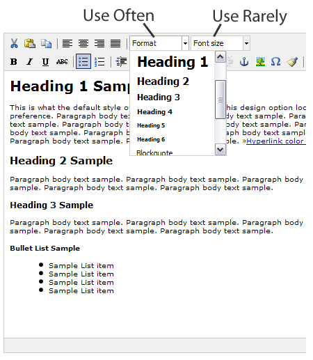
  4. Use the "font size" selector very very sparingly. Avoid at all costs using the "font size" selector to increase text size. This practice will invariably create inconsistent and amateur rendering of your content which cannot be controlled from the central style sheet. The only reason we retain the font size selector is for those rare occasions where a line of text needs to be reduced in size.
  5. Avoid using "U" Underline to emphasize inline text. People will think the underlined text is a hyperlink. Rather use the "B" (Bold) or "I" (Italic) icons to emphasize a word or sentence.
    For professional and consistent presentation of your content…
    Do Do Not

    News and Announcements

    We are extremely pleased to announce the opening of our second storefront in the beautiful city of San Jose, California. Please join us for our grand opening on April 3rd.

    News and Announcements

    We are extremely pleased to announce the opening of our second storefront in the beautiful city of San Jose, California. Please join us for our grand opening on April 3rd.

  6. Use the "Format" selector to change heading text size and create a logical hierarchy of content. Using this method allows consistent presentation for your site which is controlled by the Style Sheet.

Editing a page

Top

↑ Top