A Quick Guide to Website Content
July 14th, 2020Quick Guide to Writing Website Content
Writing content for your Website (or any marketing material for that matter) can be quite challenging. If I had to give one piece of advice it would be to keep your content as informal as possible so it’s not refined it into generic marketing drivel. What good is a Website that sounds like a million others? I’ve found that it’s often the first pass at writing your content that can be the best at establishing that authentic tone that truly resonates with your visitors.
The Vital Elements for your Website
Effective communication on your Website can be compared to effective Interstate highway billboard communication — your visitors are going 70mph and if you’re not concise and clear they won’t bother slowing down to read your message. Research has established that visitors to your Website will make a judgment within a few seconds regarding the credibility and quality of your business (initially based on the graphic design) and then they will want these fundamental questions quickly answered:
- Who are you?
- What do you do?
- Where do you do it?
- How can they learn more or try your product?
- Why are you the best choice?
This last item is called your Unique Value Proposition and is extremely important . . . in fact it should permeate all elements of your marketing communication.
The Front Page
The front page of your site is that “billboard” that needs to provide answers to these questions or a clear one-click path for your users to get those answers. Don’t make your visitors guess about these answers or which link to click to get them, otherwise they’re apt to just leave and look elsewhere. Website visitors tend not to be very patient.
Provide Proof
For those visitors who are interested in your unique value proposition, a vital supporting section is the proof section . . . it’s one thing to say you’re the greatest at this or that, but offering your visitors credible proof is going to carry exponentially more weight than you just saying so. Examples of proof sections include testimonials, portfolios and/or photos of your staff and or customers engaged in providing your products or services to clients.
Photos as Proof
 As the old saying goes, “A picture is worth a thousand words,” and this couldn’t be more true on your Website. Visitors are not going to invest the time to read 1,000 words about how great you are (even if they did, they wouldn’t believe it) but they can’t help but seeing a prominently displayed photo that, if done correctly, can instantly and powerfully communicate your values and help establish trust.
The Web is cold, impersonal and untrustworthy by nature. Avoid at all costs stock photos with cheesy models posing. The only thing you’ll accomplish is to make people wonder if your business is legitimate. Rather, make this an opportunity to develop an instant personal bond with your visitors which you’ll find is extremely potent towards establishing credibility . . . offer photos of you in an authentic setting, whether it’s a photo that provides some personal insight on your bio or photos that show your business making real customers of yours happy.
Even if your budget is low, consider hiring a professional photographer to work in conjunction with your Web designer. While you may spend a bit more on the project, you’ll be establishing a significant competitive advantage.
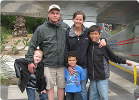
I’m still amazed that with all the material we offer on our site, and the myriads of photos of our past projects, I often have prospects and clients commenting on my profile photo which shows me with my family. People want to trust the firm they’re hiring and my willingness to share this type of photo is very effective in helping to establish that bond (as you might of guessed, that’s the photo on this page).
 Your primary goal as a site owner is to provide a completely intuitive experience for your visiting prospects. In spite of this obvious goal often simplicity becomes lost in unnecessary clutter. When this happens visitors become confused and confused visitors, according to research, tend to make a hasty retreat.
 In browsing for a replacement, I came across the polar opposite of the Osterizer Galaxie—the Oster Classic Beehive. There’s just one switch on the whole thing and that tne switch does just what I need without having to stop and think about which button to push and why.