Risingline Marketing strategy / design / development / management
(208) 352.0775

Contact Form

design & marketing blog

Marketing, design, and technical resources for making your digital and print communications more effective.

Essential Tips for Styling Text Content

January 22nd, 2010

Hints and tips for the styling and layout of your text content

With the vast amount of text being posted online and via social media these days I thought it would be beneficial to share this very brief tutorial for how (and how not) to style all that great stuff you’re sharing online. These tips apply anywhere you might post text—whether it be in one of our content management systems, WordPress, Facebook, Blogger or even old fashioned MS Word, these simple design principles will help insure your message gets the credibility that it deserves.

  1. Learn to use <shift><enter> (Windows) or <shift><return> (Mac) to insert line breaks with no vertical spacing. This practice helps insure you maintain close proximity of related content and greatly aides in readability.
    People often just hit <enter> between lines of text which adds awkward and undesirable vertical space.

    Example using <shift><enter> Example using <enter> only
    My mailing address:

    RisingLine
    111 S. Broadway St
    STE 101
    Boise, ID 83702

    My mailing address:

    RisingLine

    111 S. Broadway St

    STE 101

    Boise, ID 83702

  2. Don’t change typefaces (fonts). In fact you cannot change fonts/typefaces in our CMS text editor but many other text editors allow you to do so. The typefaces for your Website are specified in a single Style Sheet that was developed specifically for your site and insures consistency across all pages of your Website. Consistency in the presentation of your content is a cornerstone of good design.
  3. Don’t change typeface colors. For a professional consistent presentation of your content the colors are controlled through the Style Sheet. Emphasis colors (such as the color of your hyperlinks) have been selected by your professional designer specifically to harmonize with the color palette of your Website.
  4. Use the "font size" selector very very sparingly. Avoid at all costs using the "font size" selector to increase text size. This practice will invariably create inconsistent and amateur rendering of your content which cannot be controlled from the central style sheet. The only reason we retain the font size selector is for those rare occasions where a line of text needs to be reduced in size.
  5. Avoid using "U" Underline to emphasize inline text. People will think the underlined text is a hyperlink. Rather use the "B" (Bold) or "I" (Italic) icons to emphasize a word or sentence.
    For professional and consistent presentation of your content…
    Do Do Not

    News and Announcements

    We are extremely pleased to announce the opening of our second storefront in the beautiful city of San Jose, California. Please join us for our grand opening on April 3rd.

    News and Announcements

    We are extremely pleased to announce the opening of our second storefront in the beautiful city of San Jose, California. Please join us for our grand opening on April 3rd.

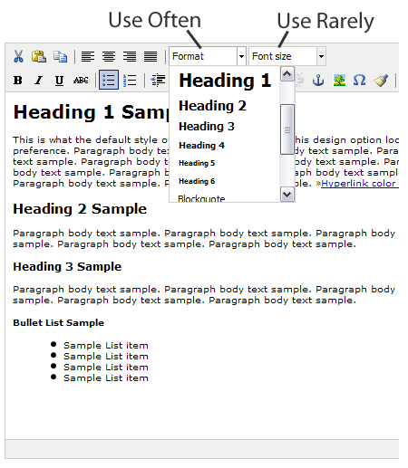
  6. Use the "Format" selector to change heading text size and create a logical hierarchy of content. Using this method allows consistent presentation for your site which is controlled by the Style Sheet.

Editing a page

How to Have a Successful Web Design Project (Part 2)

September 8th, 2009

What determines the success (or failure) of a Web development project?

While there are many important factors (both on the client and developer side) there are two all-powerful prime lynchpins that will make or break even the most qualified participants: Perspective and expectations. Some time ago I made a blog post on perspective, in this second of two posts I’ll discuss expectations.

Expectations

Without . . . a set of shared exceptions we risk orchestrating an iPod dance party”

Success in almost any transaction or relationship is determined by establishing and meeting a set of shared expectations between parties. A $3 meal at a McDonalds can be just as successful as a $200 meal at a Smith & Wollensky Steakhouse. The same degree of success can be realized at both regardless of the vast difference between a dedicated waiter serving dry-aged prime beef and a mass produced sandwich handed to us in a crumpled paper bag. It’s all about us getting what we expect.

When a client and developer view a project from a shared perspective, setting expectations is the natural progress of collaboration. Without the collaborative systematic development of a set of shared exceptions we risk orchestrating an iPod dance party. Both parties may participate but they’ll each be in their own world and when the music stops they will have completely different perspectives from which to determine success.

Developing a shared perspective is the responsibility of the developer and starts with listening, interrogating really (in a nice way, without the light), to the client and extracting the core business goals of a project, the details of the client’s unique value proposition, the needs and profile of their customers and other such vital information.

Provocative and challenging questions should be presented to the client in this stage to help them gain an outside perspective and the developer needs to be willing to adjust their biases so that in the end there is an unambiguous meeting of the minds about the project goals. In addition to the primary goals, there are many technical parameters that need to be discussed and agreed upon including development environments, creative parameters, branding continuity, etc.

After goals and requirements have been collaboratively determined, the developer is responsible for drafting a formal systematic development process that articulates the specific developer tasks that will be provided to meet those goals, and establishes a work-flow time frame for project completion.

All of this is not that profound or new. It’s really just common sense. But from my observation, the temptation is often great to gloss over a formal development of a shared perspective and expectations. It’s usually in the context where the client and developer develop good initial rapport and feel confident that they’re “on the same page.” Feelings are great but Web development projects are too complex and expensive to rely on luck for success.

Web Design Perfection

January 20th, 2009

media-templeTo my recollection, I’ve never made mention on this blog of a specific Website as an example of being truly great. While no one has elected me as the design judge of the Internet, nor will any great people likely take notice of this post, I am compelled to call out a Website that I’ve been captivated by for some time and that serves as a great example of the principles that we here at RisingLine advocate every day.

No, it’s not RisingLine.com (although I have to admit I think quite highly of that design), and before I continue I should disclose that I have absolutely no ulterior motive in praising the site I’m about to mention . . . no referral fees, or kickbacks of any kind.

So enough with the rambling, MediaTemple.net is the site to which I am directing my compliments. The first thing a visitor to their site will notice is that graphic design is extremely powerful but not overpowering. . . minimalist, detail oriented, clean, modern, just plain classy. It does what a graphic design is supposed to—provide a professional backdrop to the content of the site which beams credibility without distracting from the message.

I have to assume by the continued proliferation of shabbily designed sites on the Web that many don’t realize just how important design is. As we like mention, over and over, research has shown that a shockingly high percentage of people make a judgment call about the credibility of a company within seconds of visiting a Website based primarily on the graphic design (see the Stanford Web Credibility Research site for more insight on this topic). While my high school history teacher did not find it amusing when I offered to turn in a picture instead of the assigned 1,000 word essay, it really is true that a picture (or for our purposes a design) is worth a 1,000 words of credibility, and all that communicated in the blink of an eye.

A very common misconception is that an effective design is one that has a lot of swirls, colors, moving things and flashy graphics. While those types of sites might be appropriate in some instances (although I can’t think of any of the top of my head) professional Websites have a demanding purpose to concisely communicate value propositions and persuade their prospects to buy. Much Web design we see out there does more to distract from those goals than reach them. Media Temple offers us a great example of a well refined goal-oriented design that delivers their message with just a touch of panache.

Even the best graphic design is of no real use without concise messaging, clear communication flow and easy to understand navigation. These disciplines are collectively known as usability and are achieved exceptionally well by Media Temple. What’s even more impressive in this accomplishment is that the unique value of Media Temple’s hosting solutions are considerably more challenging to communicate than their competitors because they really are unique. Media Temple provides virtualized hosting accounts that are spread across a grid of resources as compared to the typical shared hosting company that sticks customers on a server in their farm to fight with the other squatters for finite resources. Based on my experience using their product, Media Temple’s solutions live up to the grand impression they make on their Website.

While I’m not going to get into the details, the usability of their client-side administration panel and knowledge base impresses me even more than their front end. I recently spent some time in Media Temple’s Grid-Service environment testing the CMS platform we develop on (coincidentally their hosting platform provided the most consistent high performance of any of the many shared hosting environments we’ve tested in) and I had a hard time tearing myself away from their administration panel when our project was complete.

Hats off to Media Temple for their great achievement and many kudos for providing us all a great example of what the Web should look like.

Web Design

April 24th, 2008

Graphic design is the first thing that many Web site owners and managers think about when they seek out the services of a Web developer. There is no denying that the graphic design element of a Web site is important, in fact research shows that design has an immense and immediate effect on your visitors. Within moments, about 1/2 of those visitors will make a judgment on the credibility of your company based solely on the quality of your graphic design. So design is immensely important, just like a foundation is important for a building. The foundation must be solid and it must come first but without the building on top it acheives little.

    Google screen shotWithout design being part of a holistic strategic approach to communication, it becomes impotent. A site with no design will trump the most artistically original site if the former has quality content and offers intuitive and easy to use solutions to its target visitors needs. The classic example is the most visited and arguably most successful Web site in the world: Google.

    Web sites are a lot like people, their success is ultimately based on the value they contain, not their outward appearance. This is vital to understand so that design is put into its proper place. Web design is still important, it just has to be the dressing for content of real value.

    Google is like one of those geniuses who are so recognizable and brilliant that they can get away with wearing an old t-shirt and jeans to deliver a key-note speech. It’s fair to say the brilliance of most of us is not as common knowledge.

    Web design is the same, once the foundation of quality content is present, professional and usable design is an excellent catalyst to facilitate communicating the value of your site. In my next post I’ll get into some specifics about our philosophy and methods for designing Web sites that are modern, appealing and clearly communicate the values of your organization.

    Top

    ↑ Top